6. Basic Data Analysis
Spectronon provides visualization and manipulation capabilities for hyperspectral images. SpectrononPro software has all the features of Spectronon, but also enables data acquisition from Resonon’s family of imagers. Spectronon software can be downloaded for free on Resonon’s website http://www.resonon.com/. SpectrononPro comes bundled with any of Resonon’s imaging spectrometers. Additional analysis capabilities are available in software packages such as ENVI®.
This chapter begins with basic operation of Spectronon, such as opening a hyperspectral datacube and viewing the data. A complete description of visualization tools is provided in Chapters 7-9 on Advanced Data Analysis. Chapter 10 on Custom Data Analysis: Writing Plugins discusses how to implement user-written algorithms into Spectronon, enabling custom data analyses.
References to “Spectronon” apply to “SpectrononPro” as well.
6.1. Spectronon Tools
To open a datacube, select File  Open Datacube.
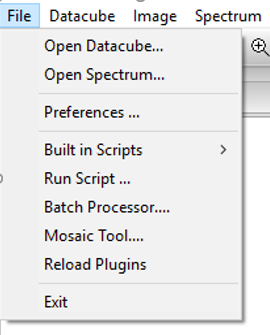
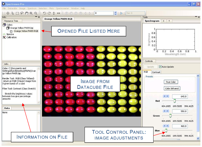
This will open a dialog that allows you to browse to find your datacube. Select your datacube and click on Open to load your datacube. This will result in the following:
- An image of your datacube will appear in the image panel
- A listing of the open datacube will appear in the Resource Tree
- Tabs will appear in the Parameters window that allow you to change the image (more on this later)
- Header information on your datacube will appear in the information panel
Note
Spectronon can open any datacube with an ENVI© formatted header. This includes .bip, bil, and .bsq formats.
This chapter employs an example datacube of M&M® and Reese’s® Pieces candies. (This datacube can be downloaded from Resonon’s website at http://downloads.resonon.com/.) By default, the datacube is opened with a true color image of the data, which approximates the appearance of the object under normal lighting conditions by combining red, green, and blue wavelengths from the datacube.
With a few minutes of practice using the available tools, you will be able to manipulate and visualize hyperspectral data quickly and efficiently.
6.2. Zoom, Pan, Flip, and Rotate Tool
 To zoom to a specific area of the image, select the magnify
tool in the toolbar and the cursor will change. Click the magnify tool in the
image, and the view will zoom in. It is also possible to click and drag a
selection within the image to zoom into the selected area.
To zoom to a specific area of the image, select the magnify
tool in the toolbar and the cursor will change. Click the magnify tool in the
image, and the view will zoom in. It is also possible to click and drag a
selection within the image to zoom into the selected area.
 To zoom out, select the demagnify tool and click anywhere in
the image.
To zoom out, select the demagnify tool and click anywhere in
the image.
 To zoom all the out and recover the original image, select the original size tool and click
anywhere in the image.
To zoom all the out and recover the original image, select the original size tool and click
anywhere in the image.
The user may also zoom in and out using the mouse scroll wheel, if available.
 To pan the image while zoomed in, select the pan tool. Click and drag
inside of the Image to pan.
To pan the image while zoomed in, select the pan tool. Click and drag
inside of the Image to pan.
 Click these tool to rotate left, rotate right, flip
vertically, or flip horizontally the image.
Click these tool to rotate left, rotate right, flip
vertically, or flip horizontally the image.
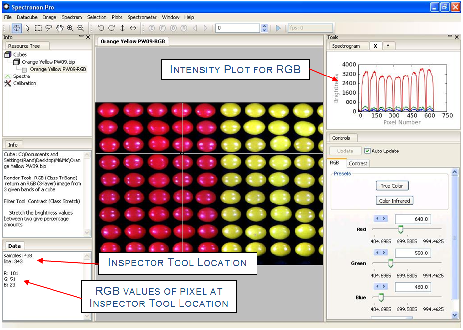
6.3. The Inspector Tool – Spectral Plots
 The inspector tool allows you to see the spectrum associated
with a pixel. Choose the inspector from the toolbar, and then click a point
inside the image. This will:
The inspector tool allows you to see the spectrum associated
with a pixel. Choose the inspector from the toolbar, and then click a point
inside the image. This will:
- Plot the spectrum for the pixel in the spectrum plot panel
- List the pixel location (sample and line number) in the data panel
- List the red (R), green (G), and blue (B) brightness values in the data panel
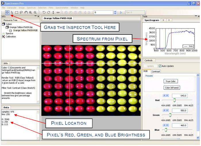
Click on other pixels to see the spectra from other pixels, click and hold while dragging the inspector tool to update the plot panel continuously.
The red, green, and blue vertical lines in the spectral plot indicate the hyperspectral wavelength bands used to generate the current image.
6.4. Region Of Interest (ROI) Tools
It is often useful to consider a group of pixels within the image. The ROI tools enable this capability and provide a number of options. As will be seen later, the ROI tool is often used during one of the first steps in classifying different objects within a hyperspectral image.
To select a Region of Interest (ROI), select either the marquee  ,
lasso
,
lasso  , or flood fill (wand)
  tool from the menu bar. Click and drag a rectangle of
interest with the marquee tool, or click and drag any closed shape with the
lasso. The floodfill tool can be used to select a contiguous region of spectrally similar pixels.
After selecting an area, right-click to reveal a pop-up menu with several options. Holding control while
selecting ROIs allows you to append to the existing selection.
tool from the menu bar. Click and drag a rectangle of
interest with the marquee tool, or click and drag any closed shape with the
lasso. The floodfill tool can be used to select a contiguous region of spectrally similar pixels.
After selecting an area, right-click to reveal a pop-up menu with several options. Holding control while
selecting ROIs allows you to append to the existing selection.
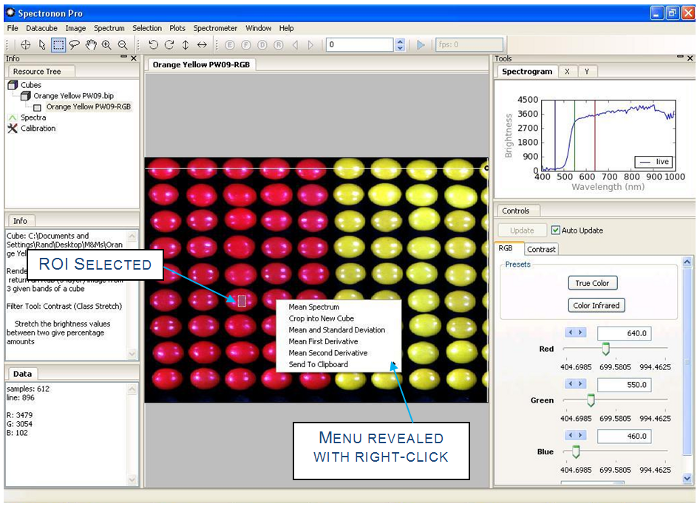
A small ROI on one of the red candies has been selected and a right-click has revealed the popup selection menu.
Hint
The selection menu is also available in the main menu.
The floodfill tool shows pixels that are spectrally similar to the chosen pixel. Spectral similarity is assessed with either Euclidean distance or Spectral Angle Mapper (SAM), along with a tolerance value. The user can set these options by accessing the Workbench tab from File → Preferences menu.
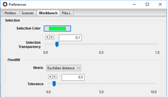
The use of the floodfill tool depends on an adjustable tolerance parameter. Floodfill operates on a representation of the datacube scaled from zero to one in each band. It calculates the Euclidean distance or SAM angle in spectral space between the clicked pixel and all contiguous pixels and expands the selection until the selected area contains all of the contiguous pixels for which the spectral distance to the clicked pixel is less than the selected tolerance. Increasing the tolerance will result in a larger selected region with greater spectral variability within that region (i.e. it allows pixels that are less similar to the clicked pixel to be included in the selection). Decreasing the tolerance will result in smaller selected regions with greater spectral similarity. As with the other selection tools, holding control while using the floodfill tool will allow a selection to be built up through multiple clicks of the tool.
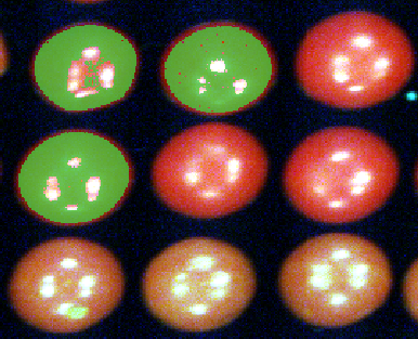
An ROI consisting of multiple parts of the image has been selected by using the floodfill tool several times.
One of the most useful selection options is mean spectrum. (Descriptions for the other ROI options can be found in Chapter 4.) Selecting the mean spectrum option calculates the mean spectrum of all the pixels within the ROI area you selected and plots the result in the spectral plotter. If the show all spectra standard deviations plugin is activated, the mean will show as a bold line outlined by two additional +/- standard deviation lines. The standard deviations are hidden in the below example. This is discussed further in the Spectronon manual section on Show / Hide Standard Deviation.
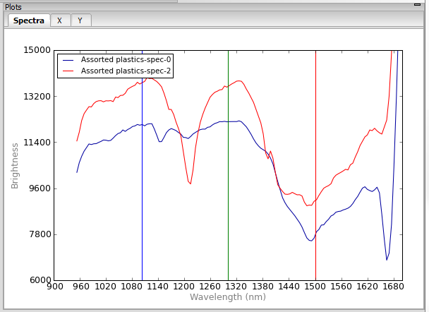
Individual spectra can be selected by clicking on the graph of the spectra. You can crop an individual spectrum by selecting it, selecting a rectangular region in the plot window, right clicking to bring up the menu, and selecting crop spectrum. You can also set the range of the plot by selecting Plots → Spectral Plotter → Set Range.
Hint
To examine the plots in more detail, you may resize the plot panel boundary by dragging the edges. Alternatively, click on the magnify tool, then click or drag in the spectral plotter to zoom in. The pan tool will allow you to pan within the spectral plotter as well.
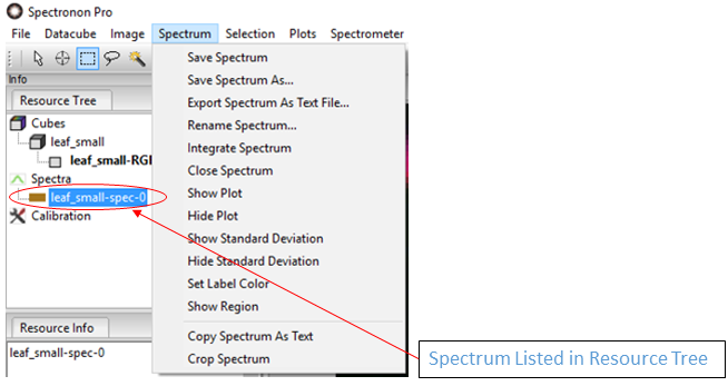
Selecting Mean Spectrum creates a new entry in the resource tree under a new heading, spectra. Right-clicking on the spectrum in the resource tree or selecting Spectrum from the menu bar will reveal a menu of options. Some of the most used options are listed below.
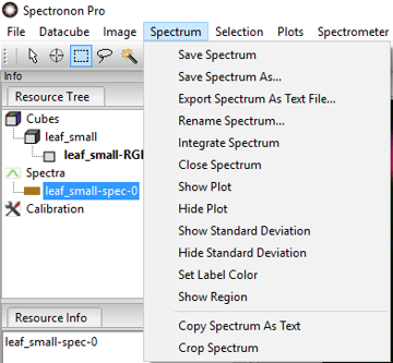
Save Spectrum
Change the name and save the spectrum as a file.
Set Label Color
Open a color picker dialog to change the label color of the spectral plot, and as shown later, classification areas based on this spectrum.
Show Region
Show the originally selected area for the ROI in the current image. This option is useful after you have selected several ROIs.
The color and transparency of the selection can be modified by selecting preferences from the file menu. The selection options are located in the workbench tab of the preferences window. A selection transparency of 1 represents a completely transparent selection (the selection will not be visible), while a selection transparency of 0 represents a completely opaque selection (the underlying render of the datacube will not be visible through the selection).
6.5. Image Visualization
Hyperspectral data can be visualized in far more ways than conventional color images. Image controls are provided in the tool control panel.
By default, the image is displayed in True Color, which means three representative bands are used to generate a red-green-blue (RGB) image, approximating how it appears to a human eye. The Color Infrared preset option provides a false-color RGB image with the red band set to an infrared wavelength. This option is useful for live vegetation datacubes.
Any time you wish to restore the image to true color, simply click on the True Color button under Presets.
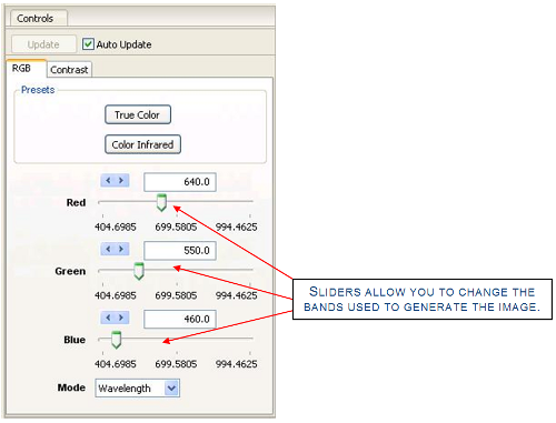
To generate false color images, use the sliders or arrows to change the wavelength bands used to create the RGB Image. This tool is often useful when trying to visualize specific spectral features associated with an object in your image. If Auto Update is not selected, click Update to generate the new image.
The Mode menu allows you to identify the band by wavelength (typically the most useful), or by band number.
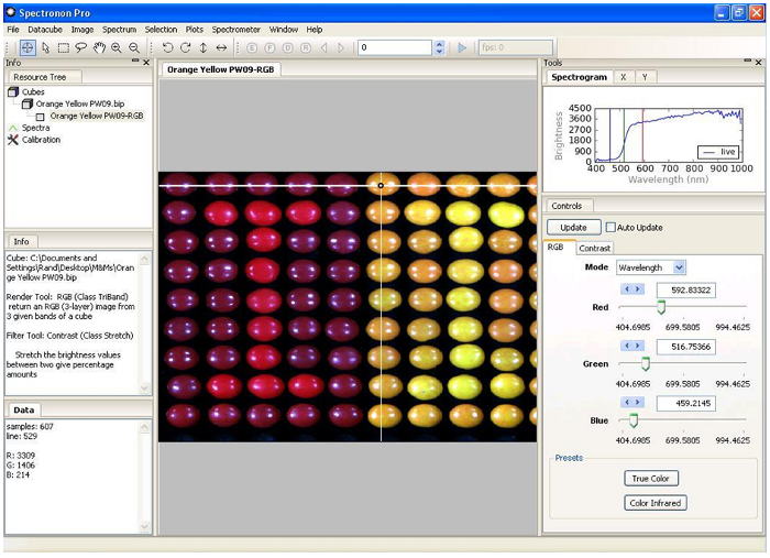
As an example, of how false-color images can reveal interesting features, move the red slider to approximately 593 nm, and the green slider to approximately 516 nm, then click Update. This generates a new false-colored image, shown below, that reveals there are actually two kinds of red candy, and suggests there are two kinds of yellow candy – each candy type is positioned in the shape of an “I”. (In Chapter 3, a classification technique will show this more clearly.)
Note
The Red, Green, and Blue vertical lines in the Spectral Plot show the location of the bands chosen to create the false-color RGB image.
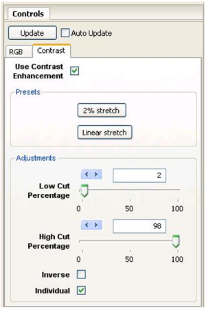
The Contrast tab in the tool control panel allows you to adjust the image contrast. If Use Contrast Enhancement is not checked, no image enhancement will be done and the tools in the Contrast tab will be not be active.
Note
Contrast enhancement does NOT change the hyperspectral data. It only changes the way the image appears.
Generally, contrast enhancement is beneficial. The 2% stretch is the default, and it sets the darkest 2% of the pixels in the image to a value of 0, and the brightest 2% of the pixels in the image to maximum brightness (255). This choice minimizes the impact of glare. You can customize the percentage of the dark pixels set to 0 and the percentage of the bright pixels set to 255 with the sliders. The Linear stretch option sets these percentages to zero.
The Inverse checkbox is useful if you wish to highlight dark pixels.
The Individual Bands checkbox controls whether the brightness levels of the three image layers are considered all together or as individual layers.
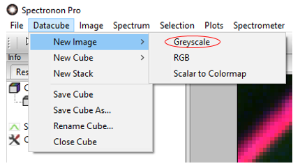
It is often useful to view a single band in a standard grayscale (black-and-white) image to visualize the impact of a single spectral feature. To do this, go to the main menu and select Datacube → New Image → Grayscale.
The controls are similar to the RGB controls. If Auto Update is not checked, be sure to click Update after moving the slider to see the grayscale image for a new band.
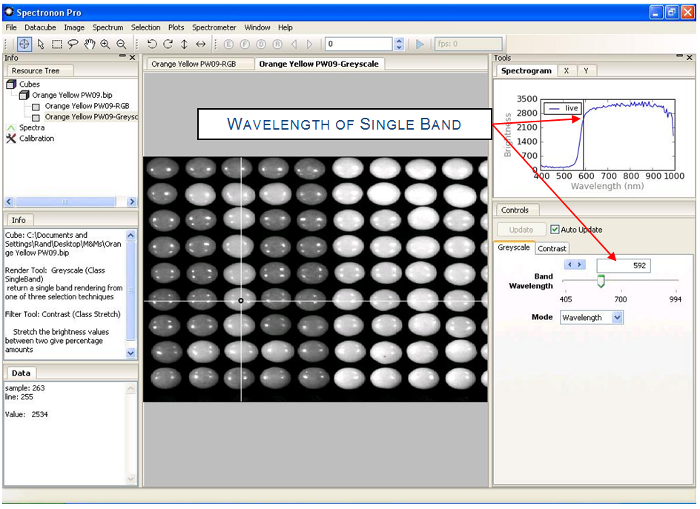
As with the RGB images, a vertical line in the Spectral Plot shows the band you have chosen. Note that even though the image is from a single band, the Inspector and ROI Tools will continue to plot and operate on all wavelengths.
Hint
With Auto Update selected in the tool control panel, you can quickly scroll through single band images.
Warning
For large datacubes or slow computers, the Auto Update refresh rate may be slow.
6.6. Plot Panel
The plot panel allows you to visualize hyperspectral data graphically. This has already been seen with the use of the Inspector and ROI tools, but here we explore the plot panel in more detail.
The plot panel has three tabs: Spectra, X, and Y. These three tabs
provide you with plots along the three axes of a datacube using the Inspector
Tool , as shown below.
Clicking on the X and Y tabs in the plot panel accesses the corresponding cross-sectional plots. The plot will show the intensity versus position value for the RGB bands used to create the image or the Grayscale band if used with a grayscale image.
Note
The direction of X and Y depends on the orientation of your cube. Moving the Inspector Tool should reveal which axis you are plotting.
Hint
Use the magnify tool , the demagnify tool , and the pan tool in the spectral plotter to navigate and examine features.
6.7. Saving Spectra, Plots, and Images
Spectronon makes it easy to save the results of your work for further investigations or for making presentations.
To save a spectrum, click the spectrum you wish to save in the Resource Tree, and then you may either (1) use the Spectrum menu in the main menu, or (2) right-click on the spectrum in the Resource Tree to reveal the menu shown below. From this menu, select either Save Spectrum or Save Spectrum As… This will open a save dialog. Once saved, the new name will appear when the file is plotted in the spectral plotter, and the file can be re-opened for use in later sessions.
Select the menu option Copy Spectrum As Text to copy the data onto your clipboard, from which you can paste it into other applications such as Notepad and Excel.
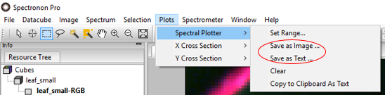
To save a plot use the Plots menu as shown above. Select which plot you wish to save (Spectral, X Cross Section, or Y Cross Section), and then select Save as Image to save as an image or Save as Text to save the plotted data as tables in text file. Both options will pop up a save Dialog.
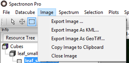
To Save an Image, select Image from the main menu, and then Export Image… This will pop up a save dialog.